Table of Contents
For many homeowners, the goal when installing a splashback is to bring light, energy and zest into the kitchen. Something that will make the whole place feel more lively and energetic, while at the same time serving an important practical purpose.
With a literally limitless range of glass splashbacks to choose from, it can be difficult to know where to start. But if your goal is to bring something zingy and zesty into your kitchen, what could be zestier than a burst of citrus?

Splashbacks in citrus colours can be incorporated into the existing décor of almost any kitchen. They can create a standout feature in their own right or can blend in with their surroundings if preferred. Either way, citrus colours by their very nature are the epitome of freshness, vibrancy and brightness, and they will not cause any pollution and environmental damage.
Still, struggling to narrow things down? Here are just a few ideas for choosing the right colour and juicy burst of citrus into your kitchen, with a high-quality splashback:
Kitchen Splashbacks Colours
1. Soft Orange

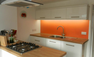
Orange splashbacks can be customised to create absolutely any tone or hue whatsoever. You can go for something that is reminiscent of a dreamy sunset or edge more towards a soft orange that borders on pale peach. Either way, it has the kind of warmth and charm that never fail to bring the entire space to life. It can also be an easy colour to pair with most wooden tones – great for the rustic farmhouse kitchen.
2. Lemon Drop
Shopping for a splashback means enjoying the freedom to experiment with colours and shades you probably would not use anywhere else in the home. Case in point example – how about a near-neon lemon drop splashback, with an eye-catching acidic aesthetic? It may sound OTT, but beautiful bursts of vivid colours like these can be just the thing to breathe life into the kitchen. Of course, this is the type of colour that pairs best with a predominantly neutral theme. If your units, cabinets and countertops are fairly plain, zesting things up with a bright and bold splashback comes highly recommended.
3. Lime Green

All of the above applies with a lime green splashback, which can be toned down to a gentler hue if preferred. Green splashbacks bring a sense of crispness into the kitchen, with echoes of the great outdoors and a safe COVID cleaner. This is the kind of colour that pairs best with a fairly plain and neutral backdrop. Or perhaps, a kitchen that already features plenty of green tones, adding a kick of something energetic to its ambience.
4. Honey
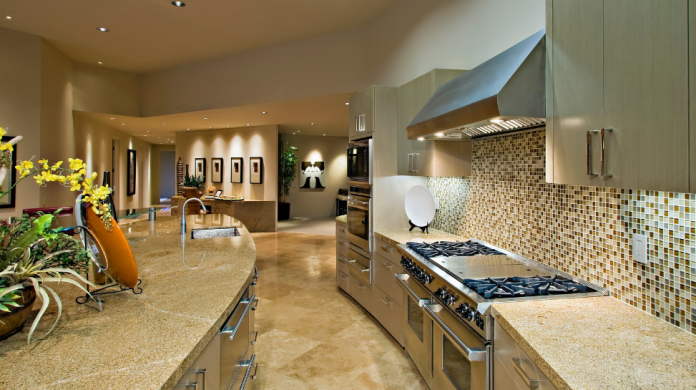
Honey is less a colour, and more a complete range of colours in its own right. It is a fantastically versatile choice that covers everything from toffee browns to super-pale yellows. This is another colour that brings a touch of nature into the kitchen with that dreamy sunrise/sunset vibe that is always appealing. Adjust the intensity and hue of the colour to suit your kitchen’s current décor and it is practically impossible to go wrong.


